FREELANCE
Logo creation, Branding
To come up with a great name - I thought - let’s start with the basics. Questioning speach, language in general.
Wernicke stands for the part of the brain called Wernicke’s area. It is one of the two parts that is linked to speech . It is involved in the comprehension of written and spoken language. (great name for a translation agency)
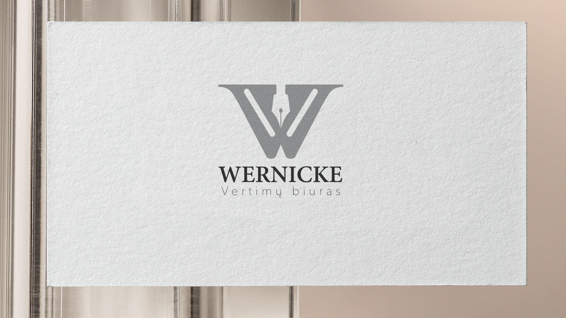
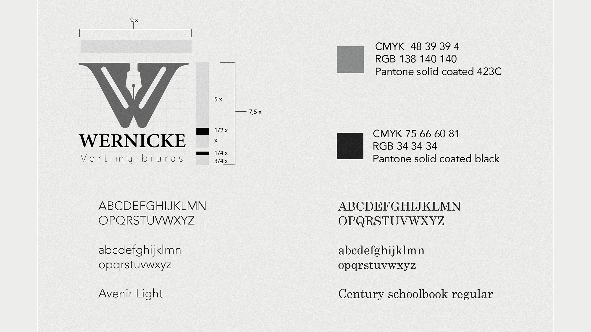
A translation agency has to change one text to the other - so I used the silhouette of a pen and used it in the negative space of the letter “W”, hinting that the quil is penetrating the mind, tapping into the depths and comes out with new different text coded in another language.
The company wanted something grey, monochrome, hinting it’s stability and being able for the quality of their work to shine.


