FREELANCE
LOGO, DESIGN, BRANDING, PACKAGING
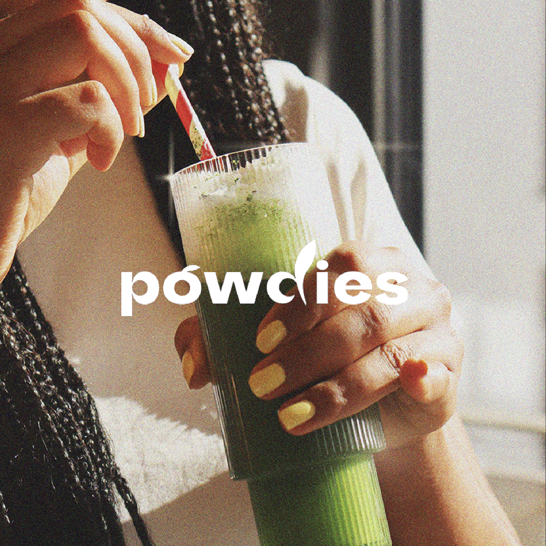
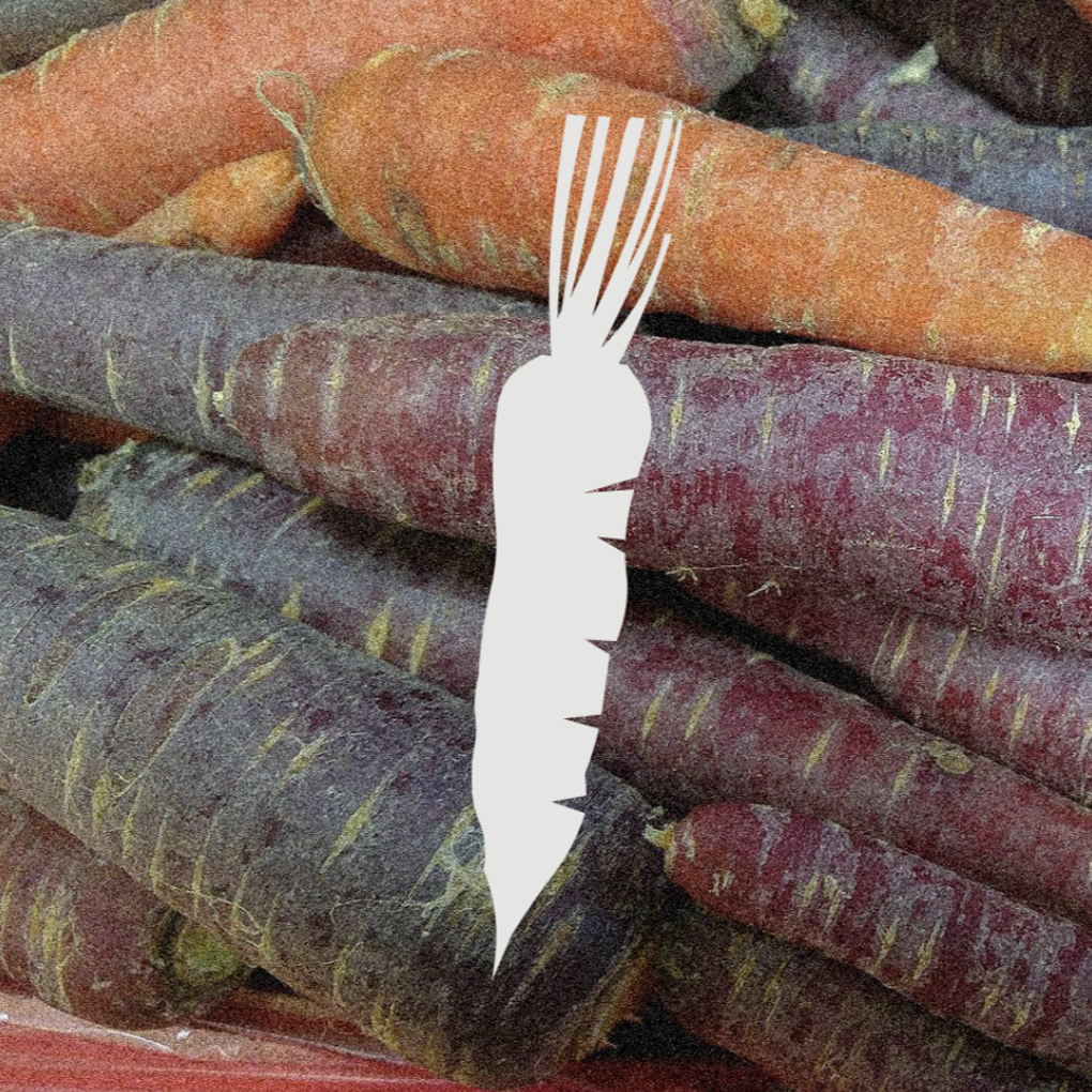
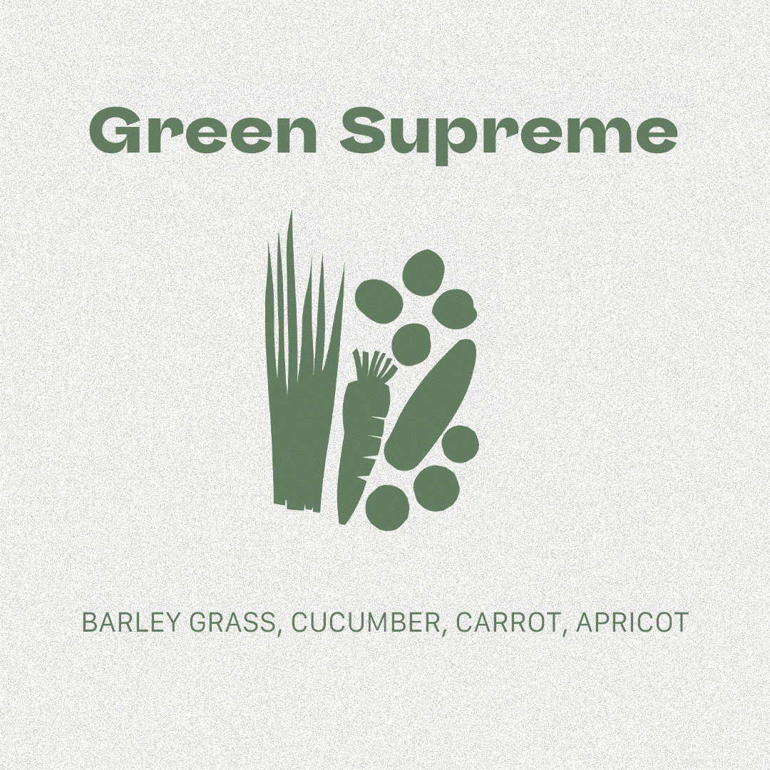
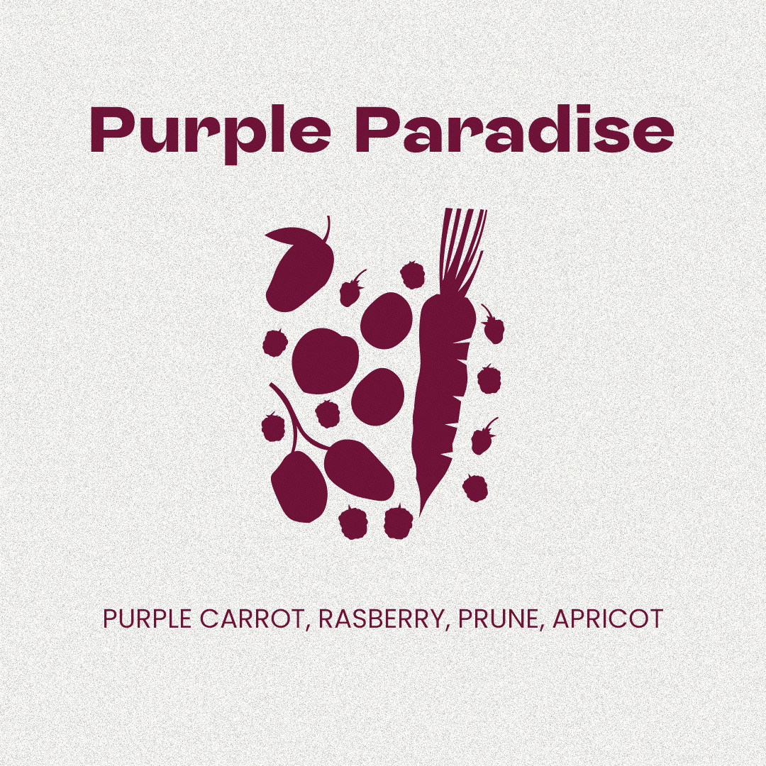
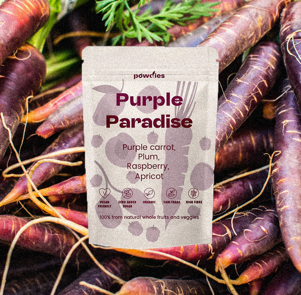
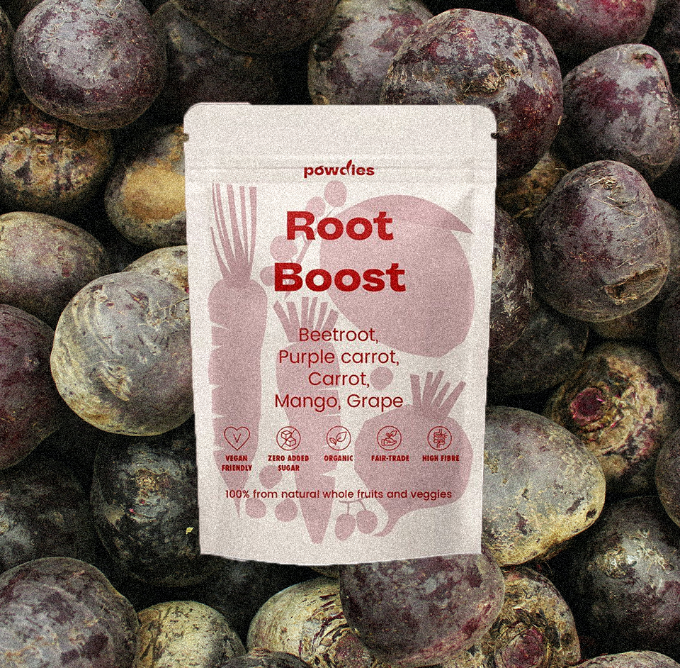
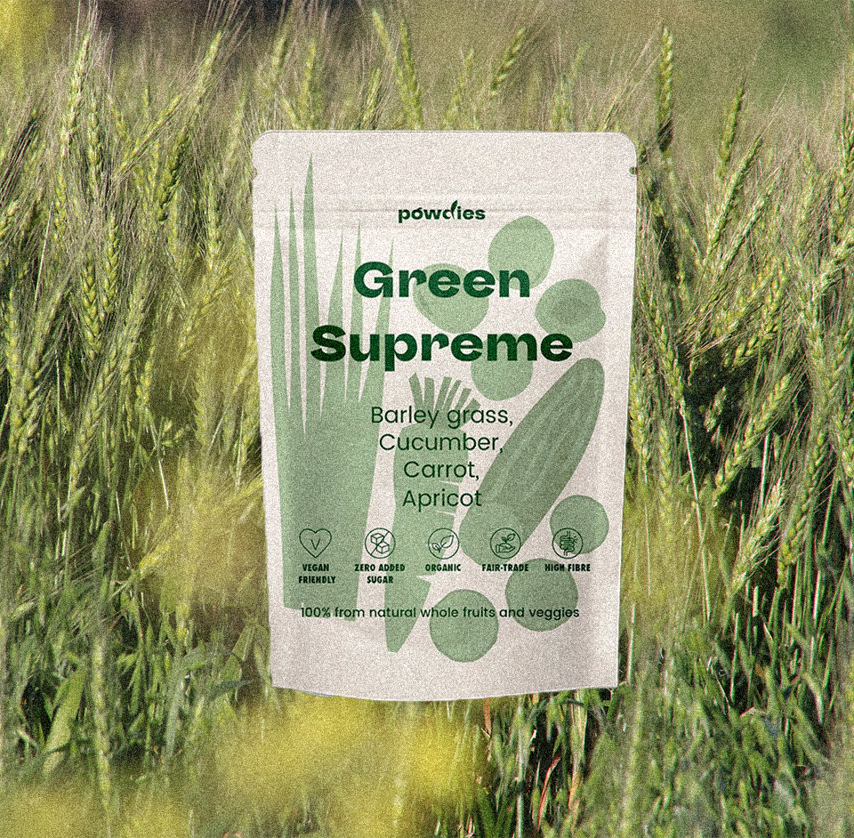
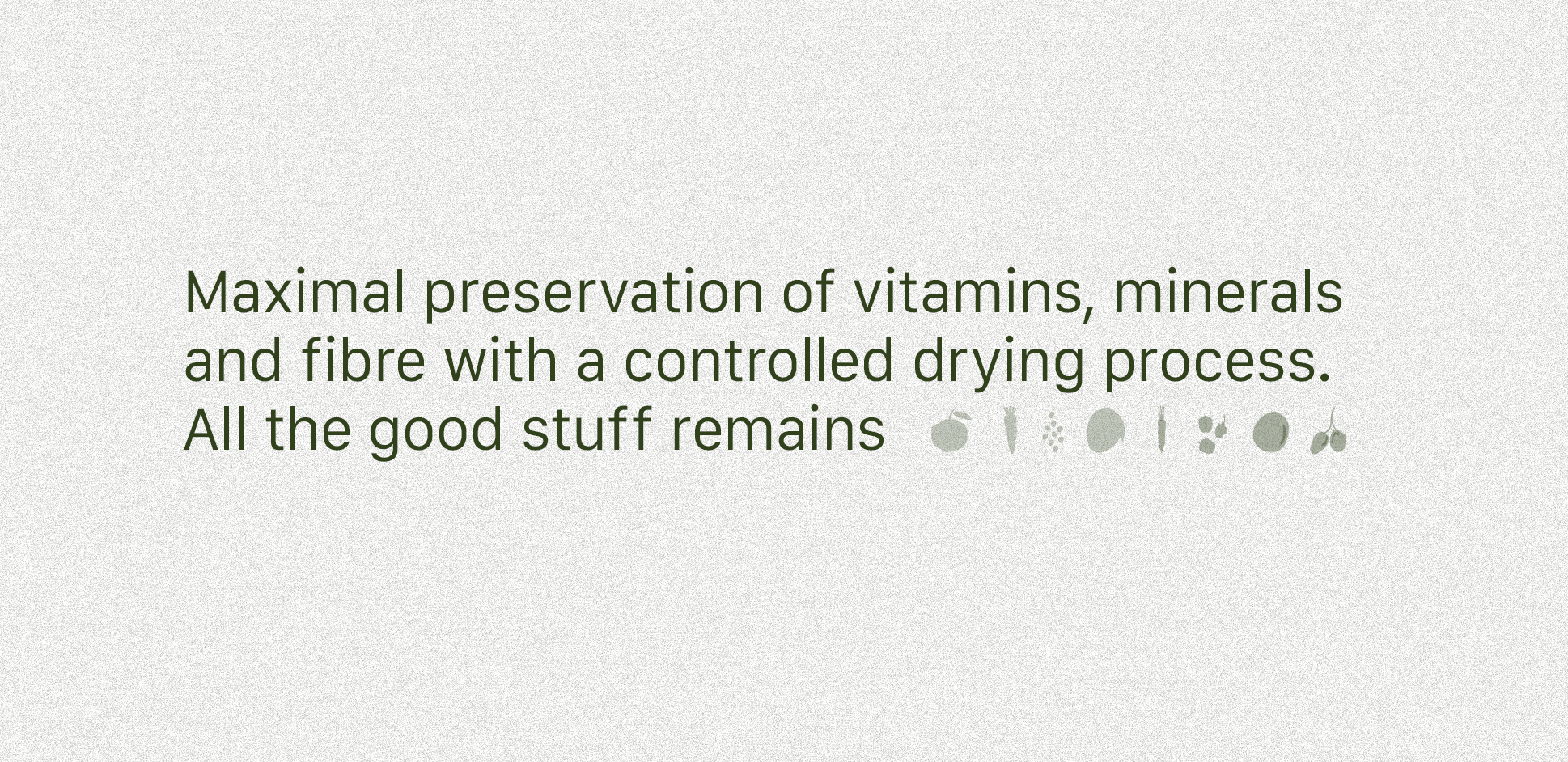
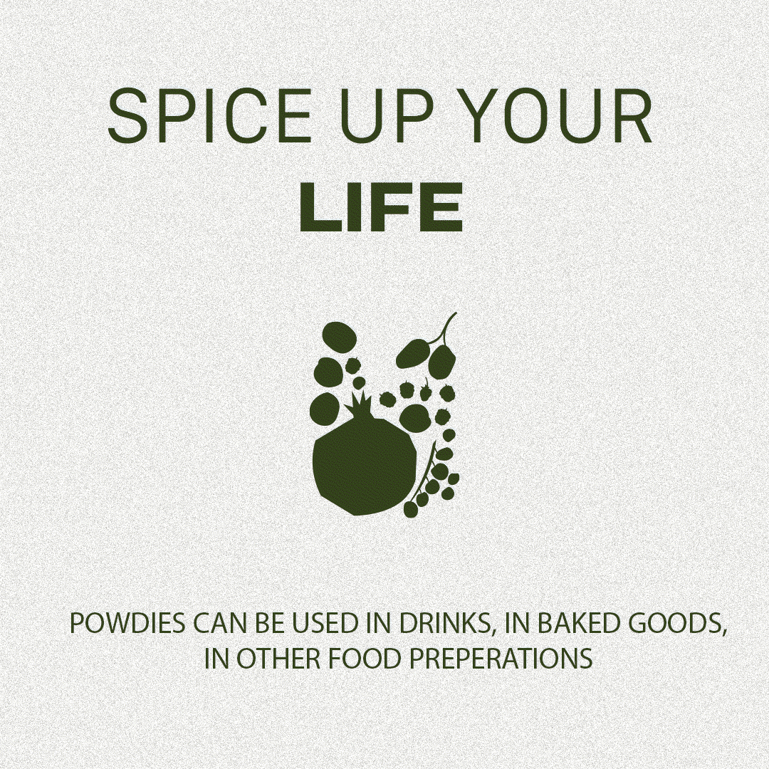
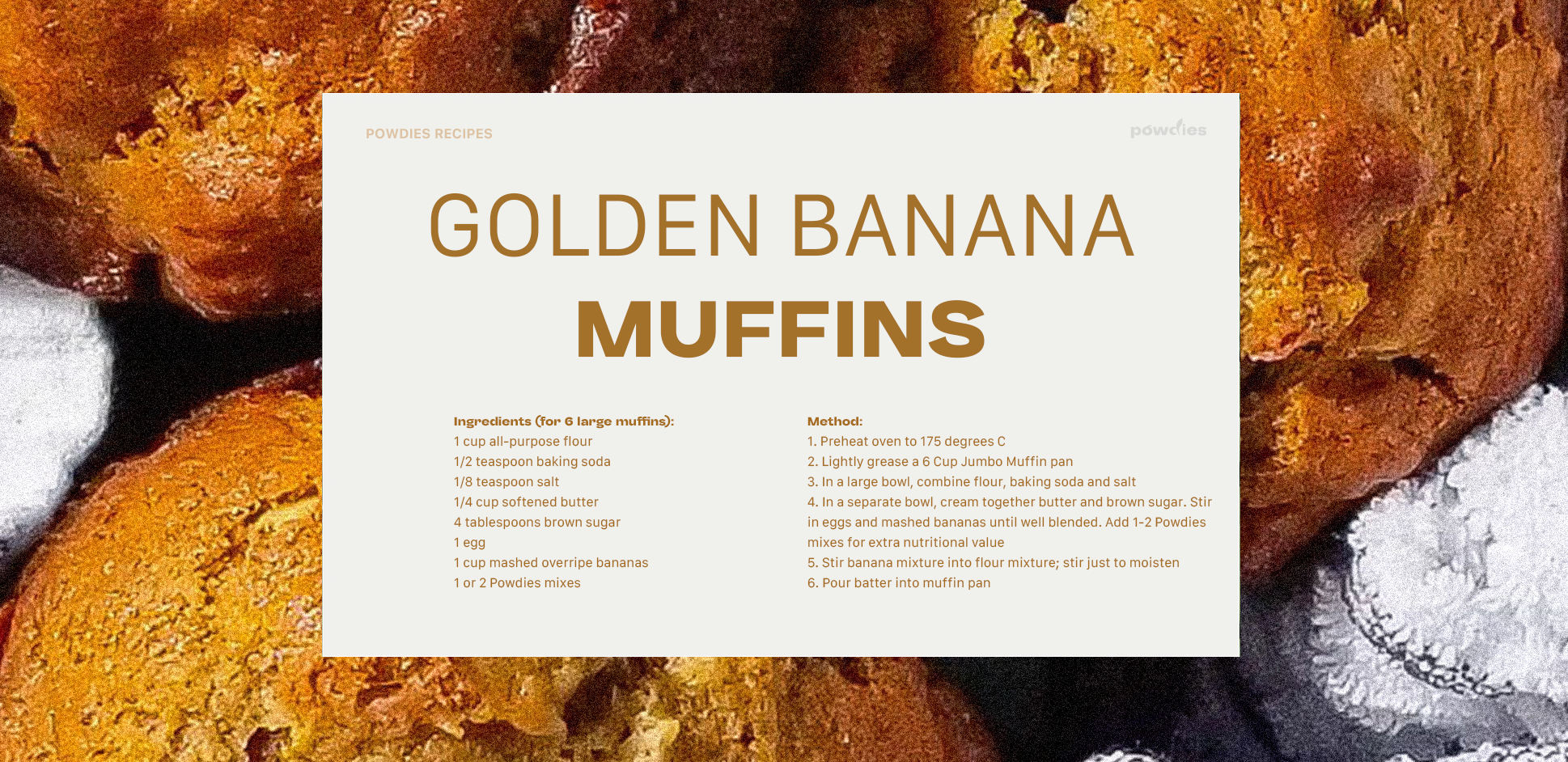
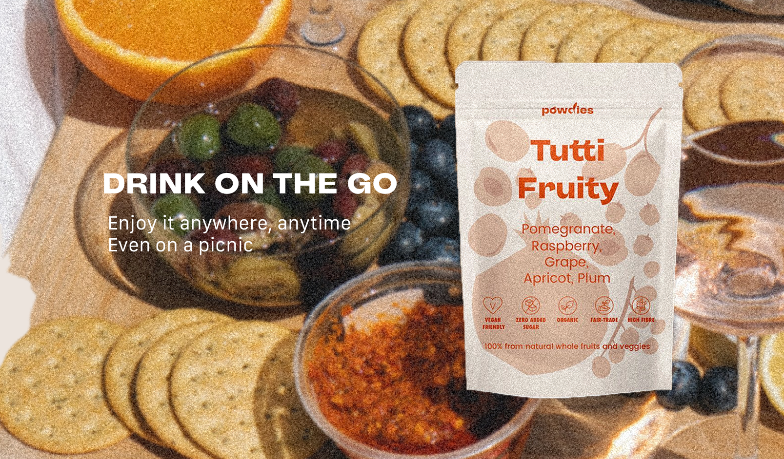
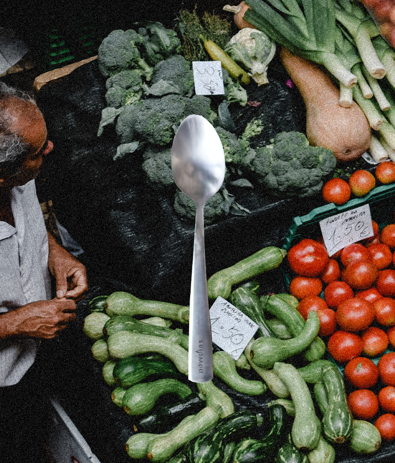
The goal was to position Powdies as an easy and convenient way to get your daily recommended intake of fruits and veggies. Even though it’s a powdered drink, I wanted to make sure that the fruits and veggies stayed visible, so I came up with the idea of creating cutout shadow formage of the fruits in the drinks, to inlclude on the package.
With this rebrand & logo, we are hoping to capture the attention of young adults who are looking for a simple and healthy solution to incorporate into their busy lifestyles.