Branding concept for the event of Eternal life, the announcement “Death is dead”
Branding concept for the event of Eternal life, the announcement “Death is dead”
"Death is dead” is a speculative design project that explores existentialism and creates a visual solution for the idea of immortality. In the near future, “Death is dead” will be announced to the world as a victorius win for all of humanity - death does no longer exist. We will become crowned with diadems of immortality and introduced to a new way of life that bring purpose during our infinite time. This project raises inquiries of eternity, never-ending routine and the problem of immortality. The question is - did we really want this?
Overall, this project has been a major undertaking, involving the identification of an existential problem and attempts to visualize and make sense of it all. Although this is not the final version, and the topic is too extensive to compress into a bachelor's project, I have revisited it over the years and created additional objects. However, it is still a work in progress and far from complete.

The logo of immortal life:
The dynamic logo is the primary symbol of new eternal life. Its multi-linear design creates a rhythmic pattern of black and white movement that symbolizes the duality of eternity and death. It resembles a flipped infinity sign, and the movement of the snake is associated with renewal and never-ending life. Upon closer examination, we see the perpetual motion of destiny, which suggests a sense of skepticism towards eternity. The logo's form, with its top and bottom poles representing death and eternity, and its widening middle, represents a balance between these polarities - life, which is a combination of death and eternity.
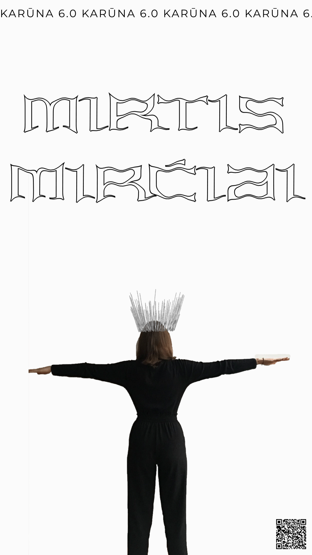
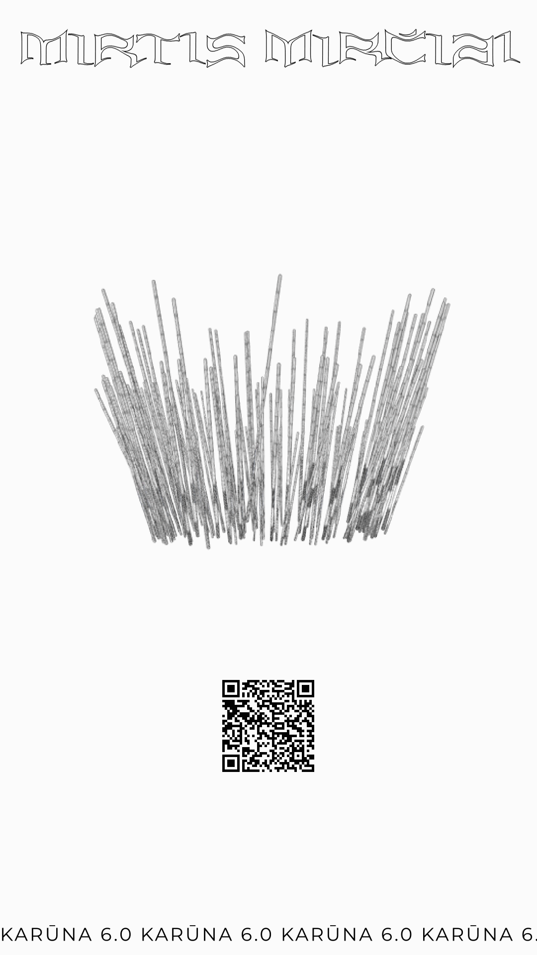
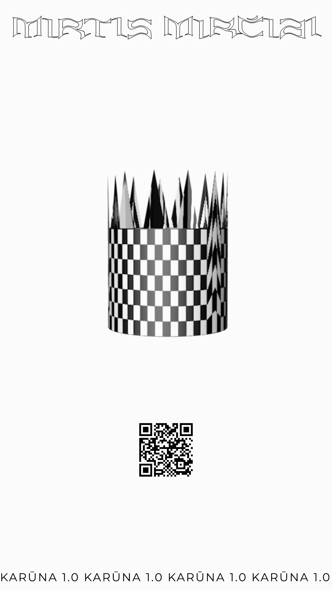
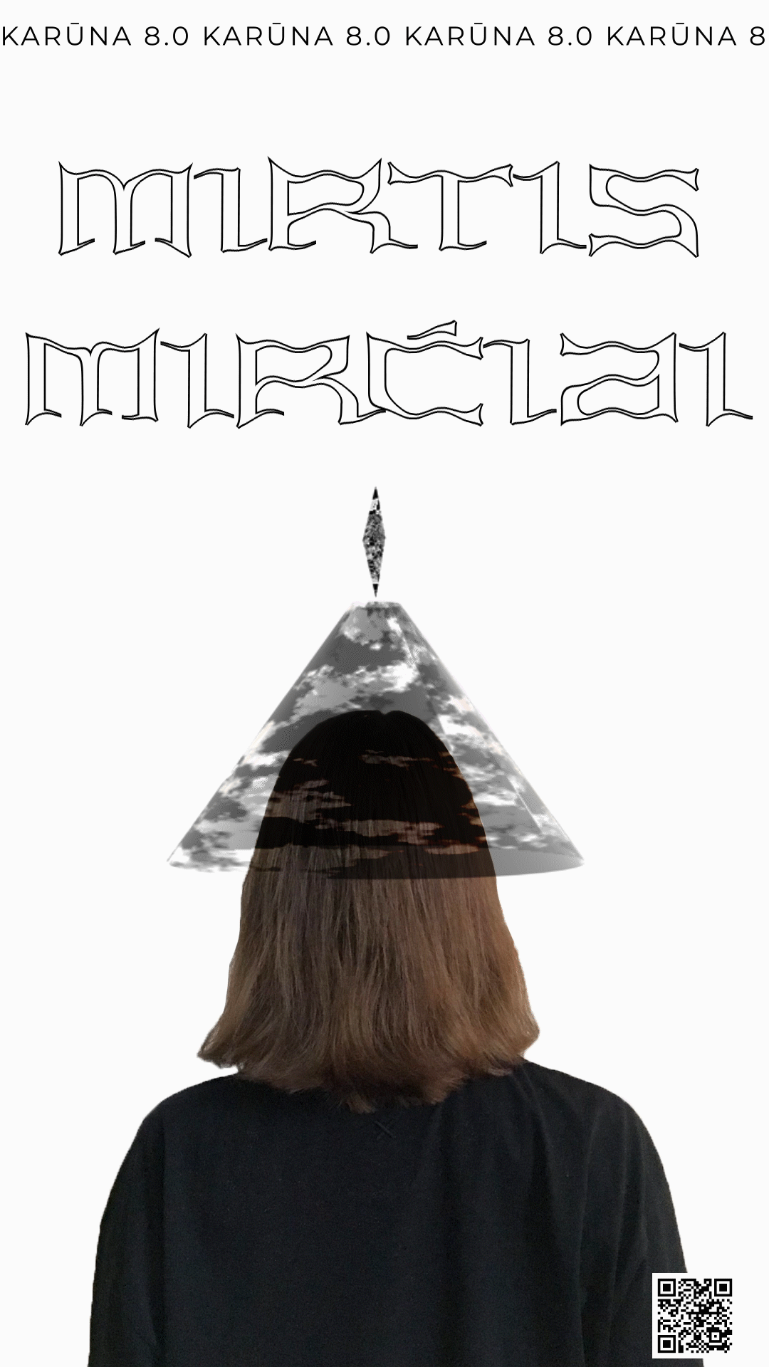
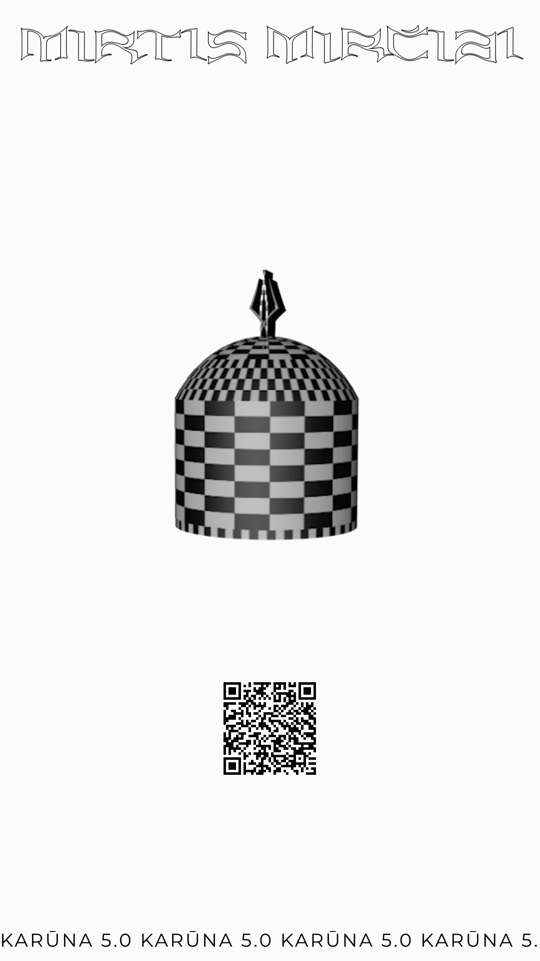
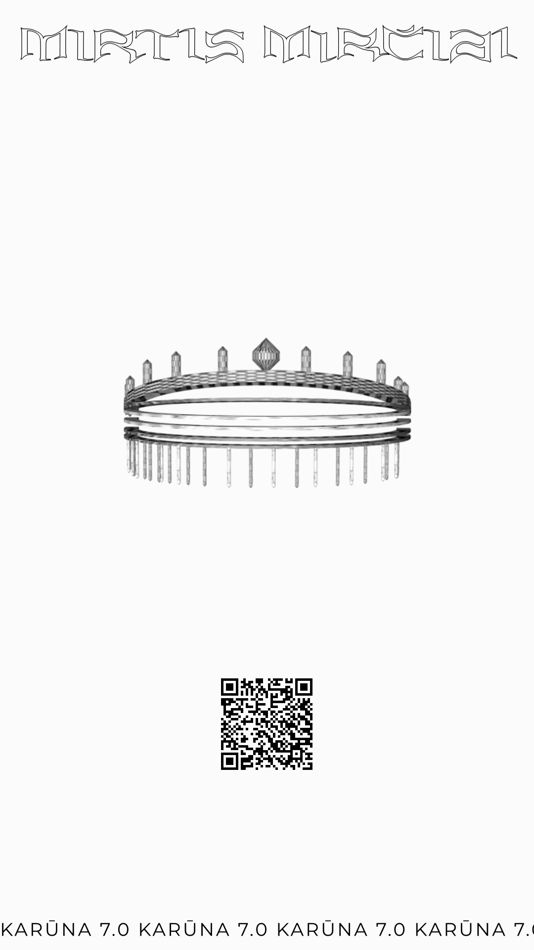
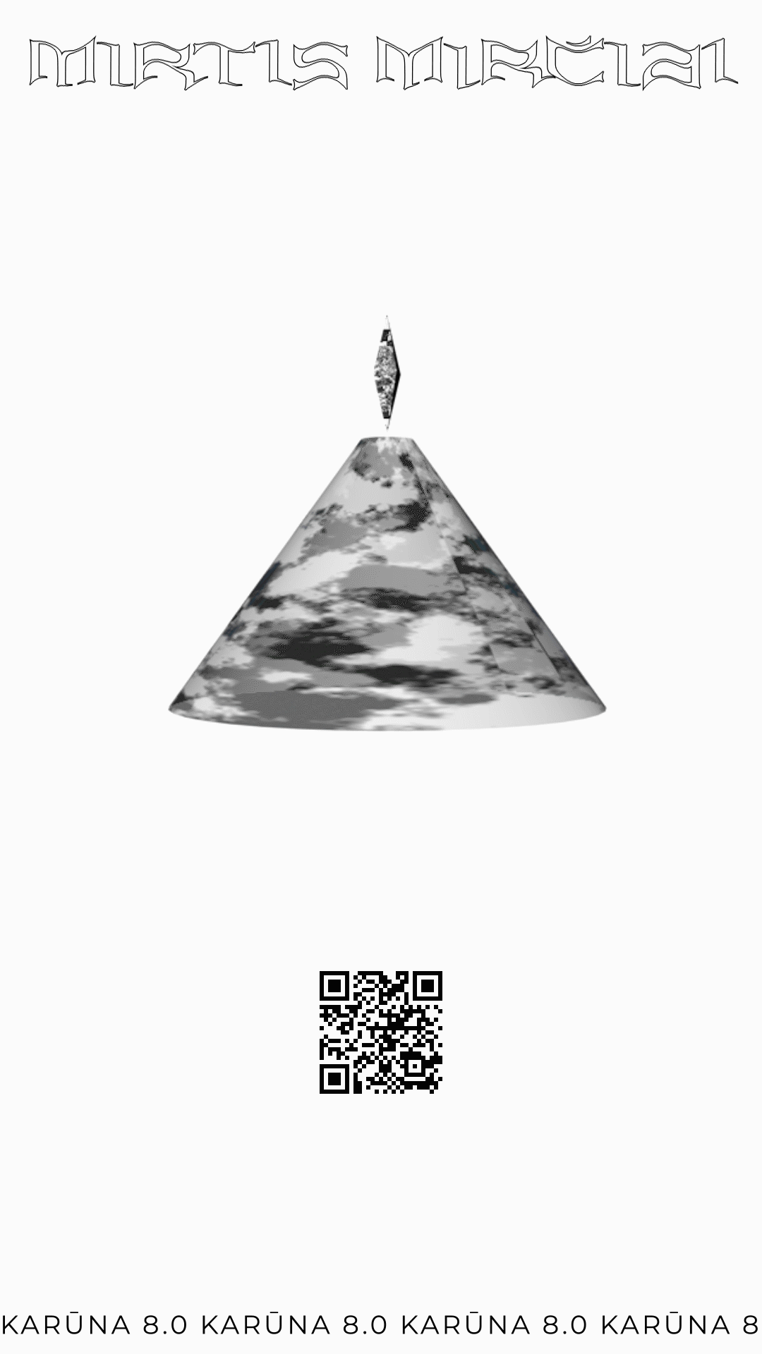
Immortality crowns:
The crowns in this speculative project hold great symbolic value, representing victory, honor, and most importantly, eternal life through the defeat of death. Throughout history, crowns have been associated with immortality and victory, symbolizing the attainment of immortality on the physical plane by mortal men. The circular shape of the crown also symbolizes the never-ending cycle of time and the need for us to make sense of our existence, while the glowing headdress is a metaphor for enlightenment and a new position in life, where we are no longer temporary beings but the monarchs of our own lives.
Available on instagram to try on!
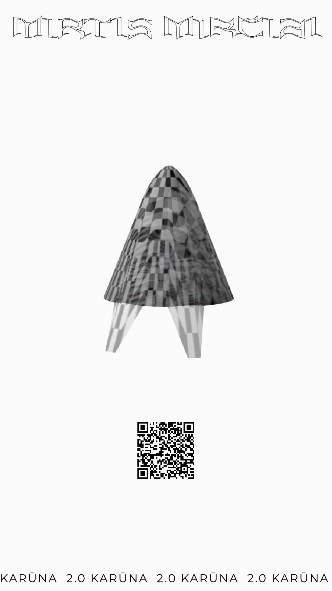
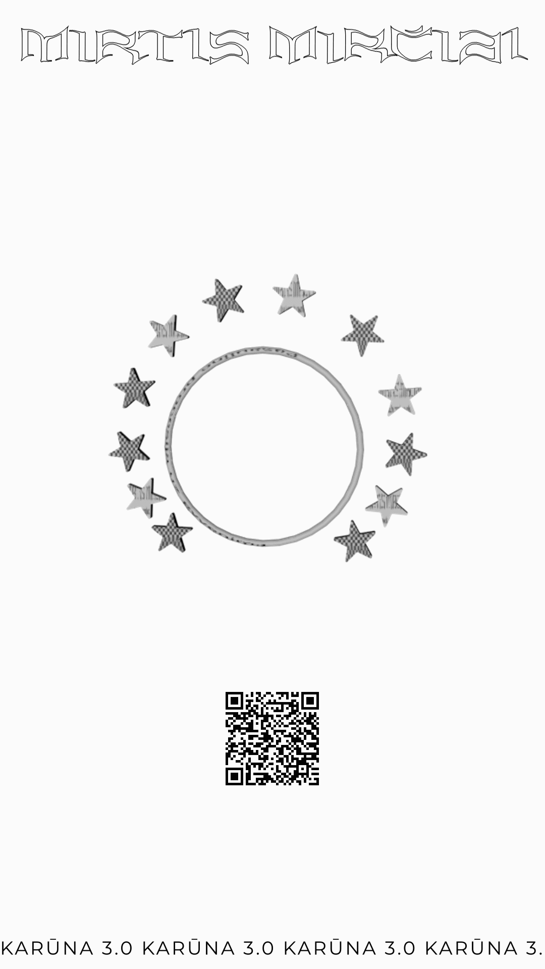
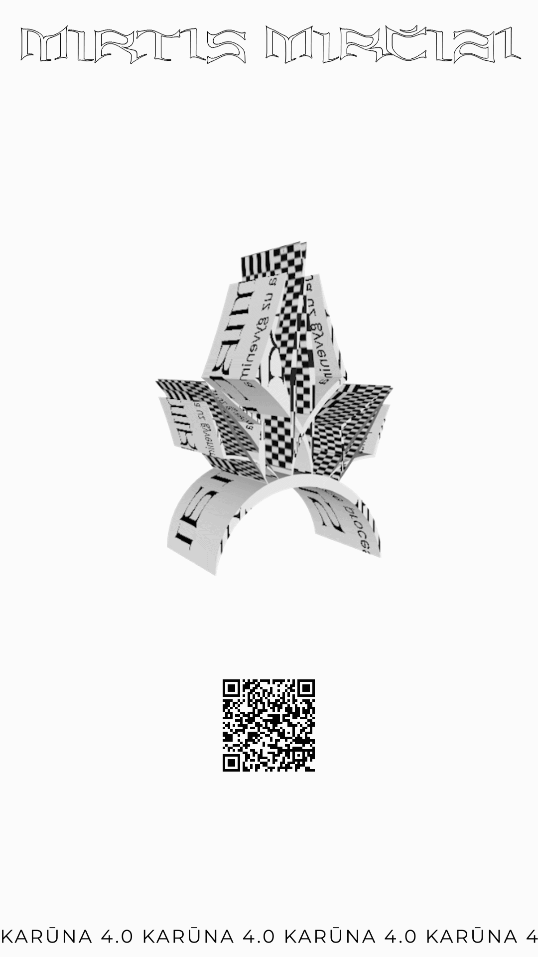
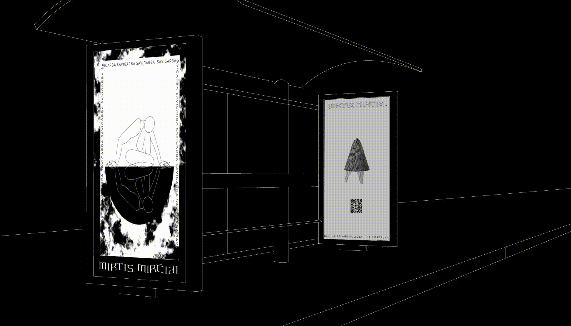
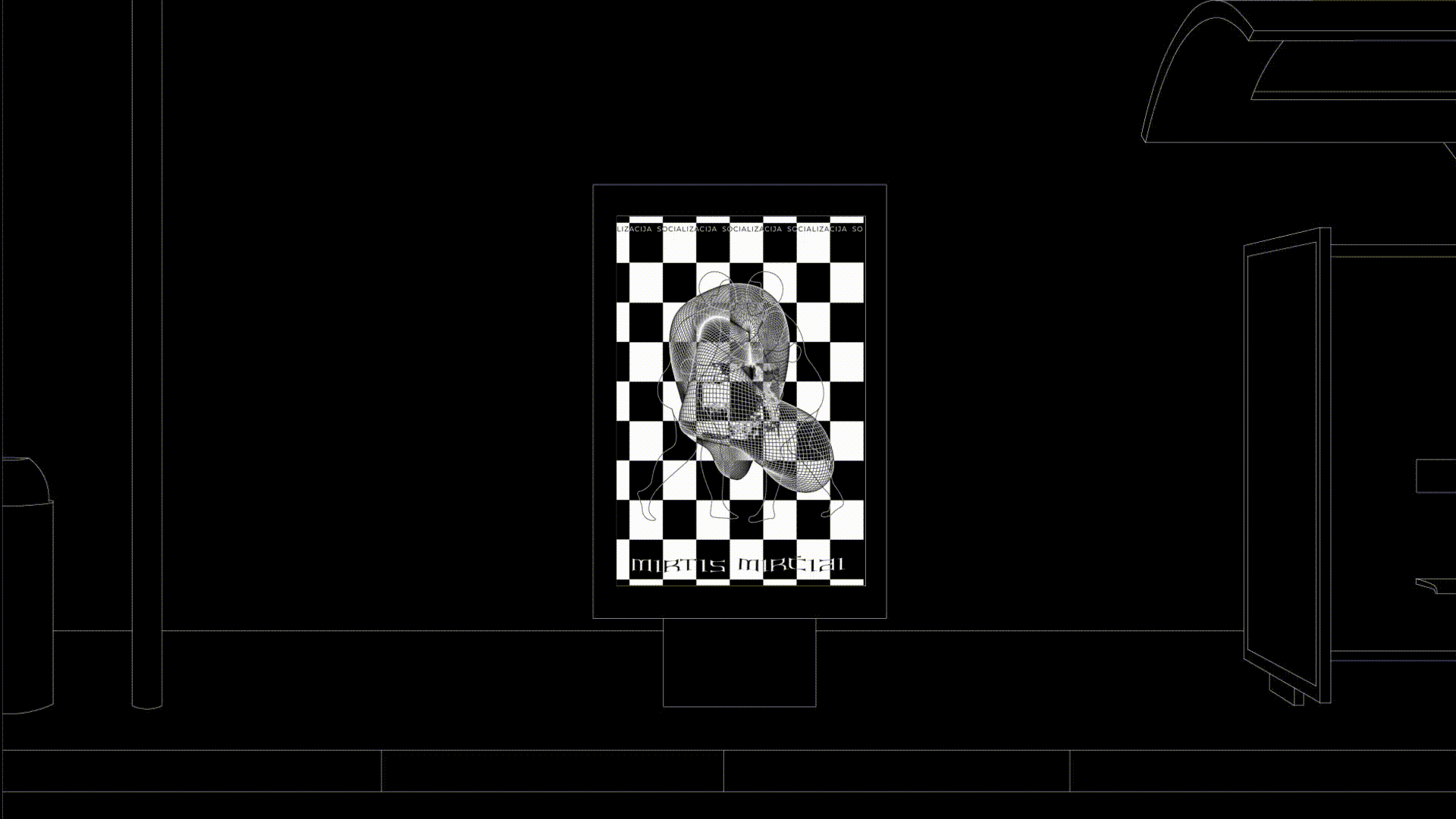
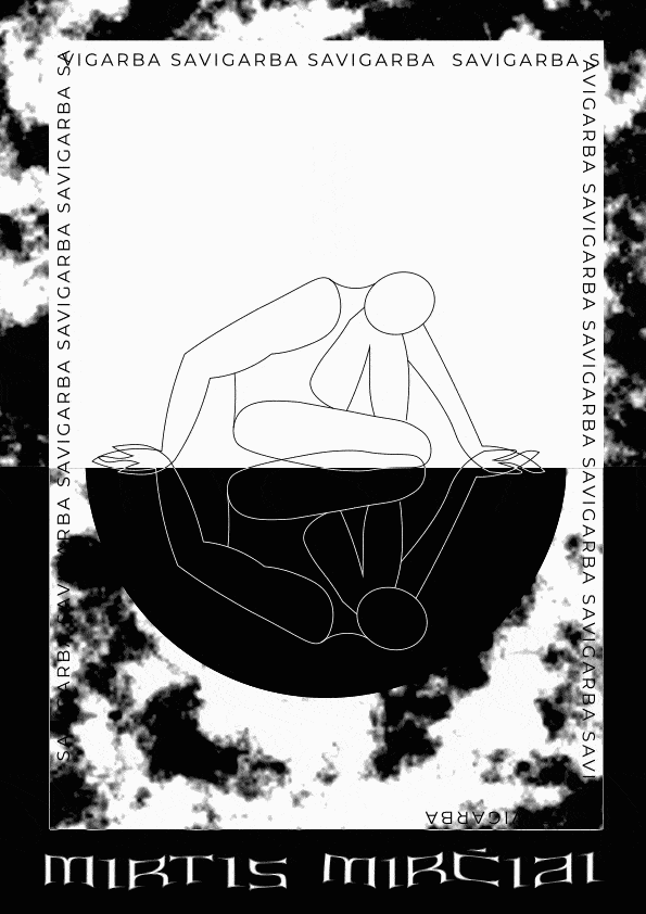
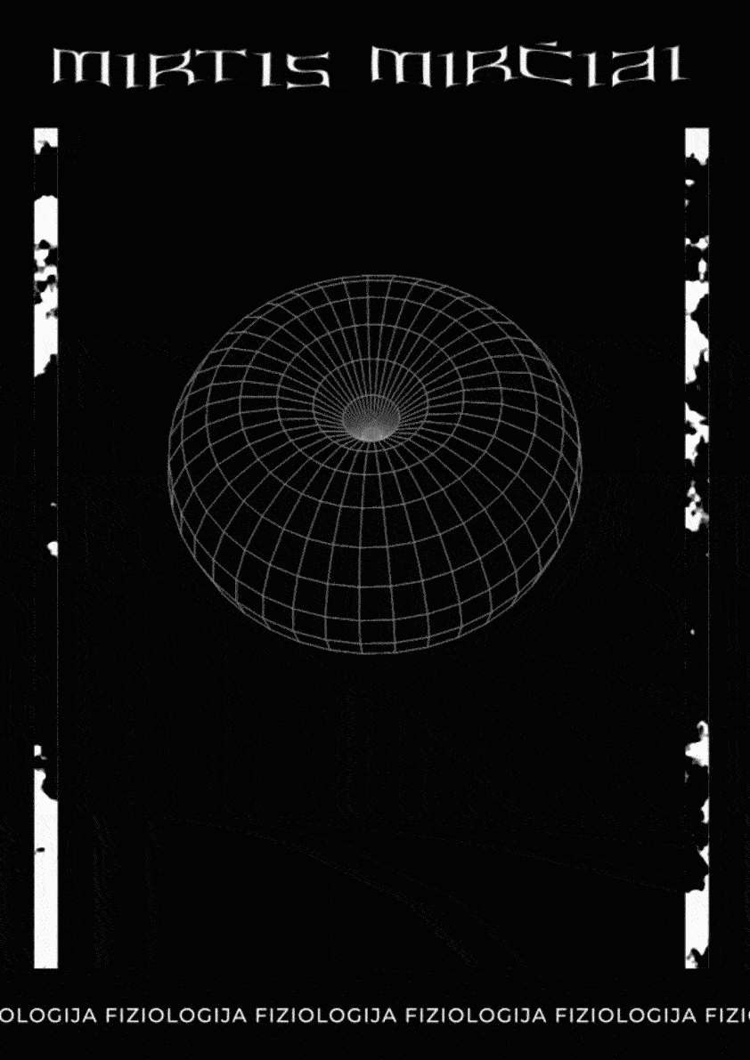
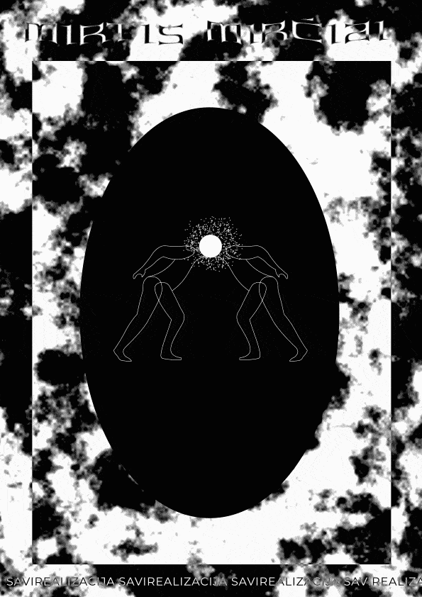
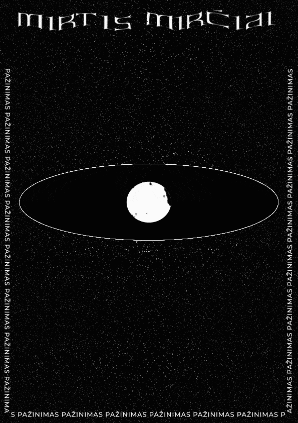
The new system:
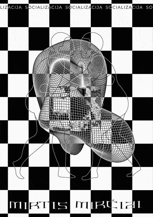
Posters, depicting the new system:
The dynamic poters encode a sense of eternity in constant motion. Each poster symbolizes the separate levels, which will give meaning to the new eternal life. It’s like advertising that announces the new features and characteristics of the changed rhythm of daily life.
The posters' constant rotation represents an infinite moment with no end, reflecting the new reality of eternal life. The contrast of black and white colors emphasizes the duality of life and the need for skepticism towards the new order. The celestial texture adds depth and symbolism, representing the once unattainable eternity now within reach. As restless creatures, can we fundamentally change when we've reached eternal life? The sky becomes a metaphor for our craving for more, and it remains to be seen if we can accept the convergence of sky and life in the new world.
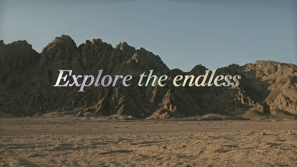
Video animation the visualization of entering the eternal life and the never ending cicle:
Music specialy made by Jeroen JanssenThe video "Death to Death" unites the project elements with consistent colors and constant movement. It begins with the linear concept of life and transitions to a routine free from temporary life, culminating in the slogan “vita vivat”. The circle of eternity reveals a new hierarchical system, but a deformed mass prompts questions about eternal life. The appearance of little humans illustrates the monotony of eternal life, emphasizing its illusory nature. The video concludes with the text “Death is dead” and the symbol of eternity on a dark background, inviting viewers to ponder the implications of eternal life with skepticism.